Flourish
About
AI Data Visualization
Flourish creates interactive, animated data visualizations without coding, with templates used by major publishers.
Tool Details Freemium
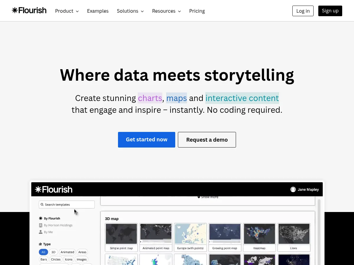
Flourish is a powerful data visualization and storytelling platform that makes creating interactive charts, maps, and animated graphics remarkably accessible. Its template-driven approach allows users to produce publication-quality visualizations without coding, while still offering enough customization for advanced users. The platform excels at animated and scrollytelling formats, making it a favorite among journalists and content teams. The freemium tier is generous for public projects, though the $63/month entry point for private work and team features may give solo users pause. API availability adds welcome flexibility for embedding and automation workflows. Strengths include an extensive template library, smooth animations, and excellent embed options. Limitations include less granular control compared to code-based tools like D3.js, and the pricing can escalate for organizations needing multiple seats. Compared to alternatives like Datawrapper or Tableau Public, Flourish strikes an excellent balance between visual polish and ease of use, particularly for narrative-driven data presentations.
Flourish stands out as a premier platform for creating studio-quality data visualizations and interactive stories without writing a single line of code. It excels in transforming complex datasets into engaging "scrollytelling" experiences, making it a favorite among journalists and corporate communicators. The interface is intuitive, offering a vast library of dynamic templates"from racing bar charts to projection maps"that handle data formatting intelligently.
While the Freemium model is generous for public projects, the starting price for private data features is relatively high, which may deter individual freelancers. However, for organizations requiring robust API access and seamless website embedding, the investment is justifiable. Unlike the steeper learning curves found in tools like Tableau or the coding requirements of D3.js, Flourish bridges the gap between simplicity and professional output, making it a top-tier choice for users prioritizing aesthetics and narrative flow.